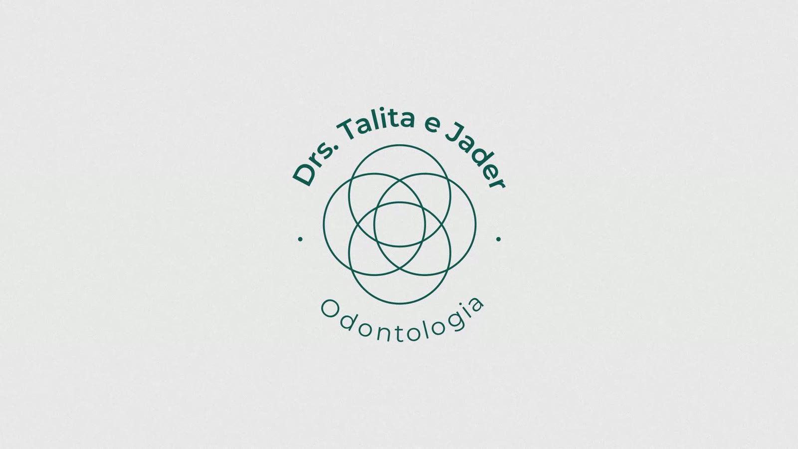
Drs. Talita e Jader: a brand symbol explained through animation, without words
An animated video for a dental practice's rebrand that explains the symbol and the hidden elements in its four circles with visuals instead of words.
2 daysplan and storyboard
1.5 weeksanimation
01Context
Two dentists went through a rebrand and wanted an animated video to present the vision of the brand: who they are, told through visuals instead of words.
02Approach
- Explain the symbol
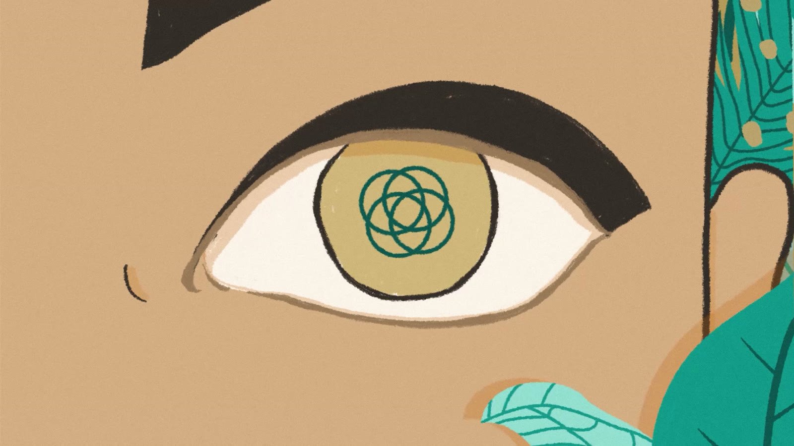
- The brand hides elements inside its four circles, so the animation explains the core symbol visually and shows what each part means.
- Classic animation as a reference
- I took inspiration from classic animation: a lower frame rate, the brand colors kept, and specific effects for more sober shades.
- 3D and cel together
- To add depth and consistency, I combined 3D animation with cel animation and divided the video into sections, one for each element of the brand.
Frames and process





Tools
- After Effects
- Blender (Eevee)
- Illustrator
- Photoshop
Next case