Brankas: a first animation style, built from brand guidelines alone
An explainer for a brand refresh. The company had never used animation, so I created the style from scratch using only its brand guidelines.
1 dayplan and storyboard
1.5 daysanimation
01Challenge
Brankas was refining its communication to connect better with the public and wanted its services to be easier to grasp. It asked for an explainer on how it works and what it offers consumers and businesses.
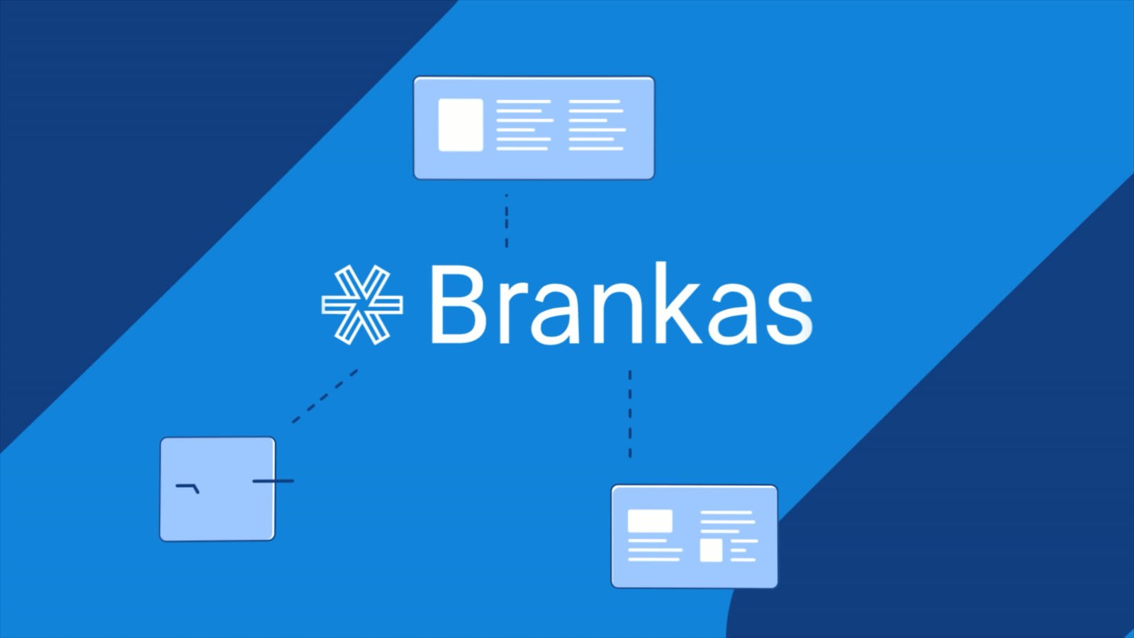
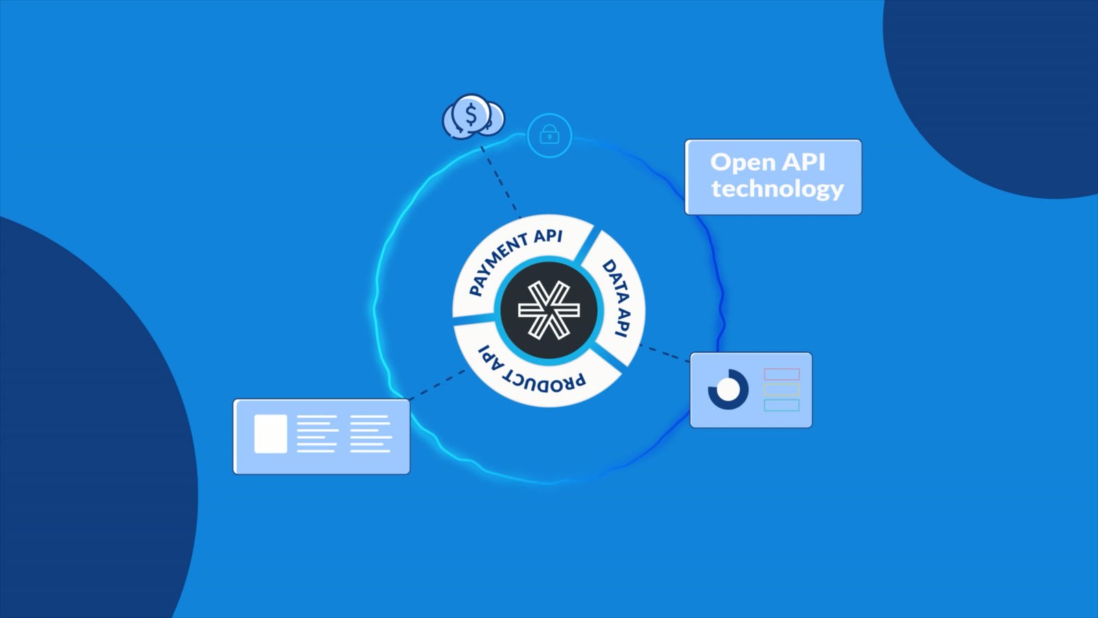
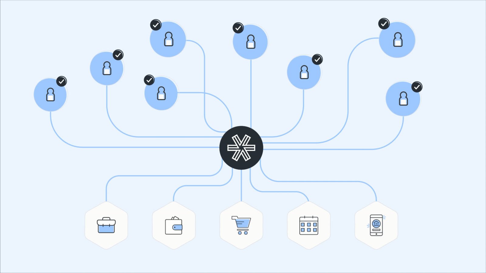
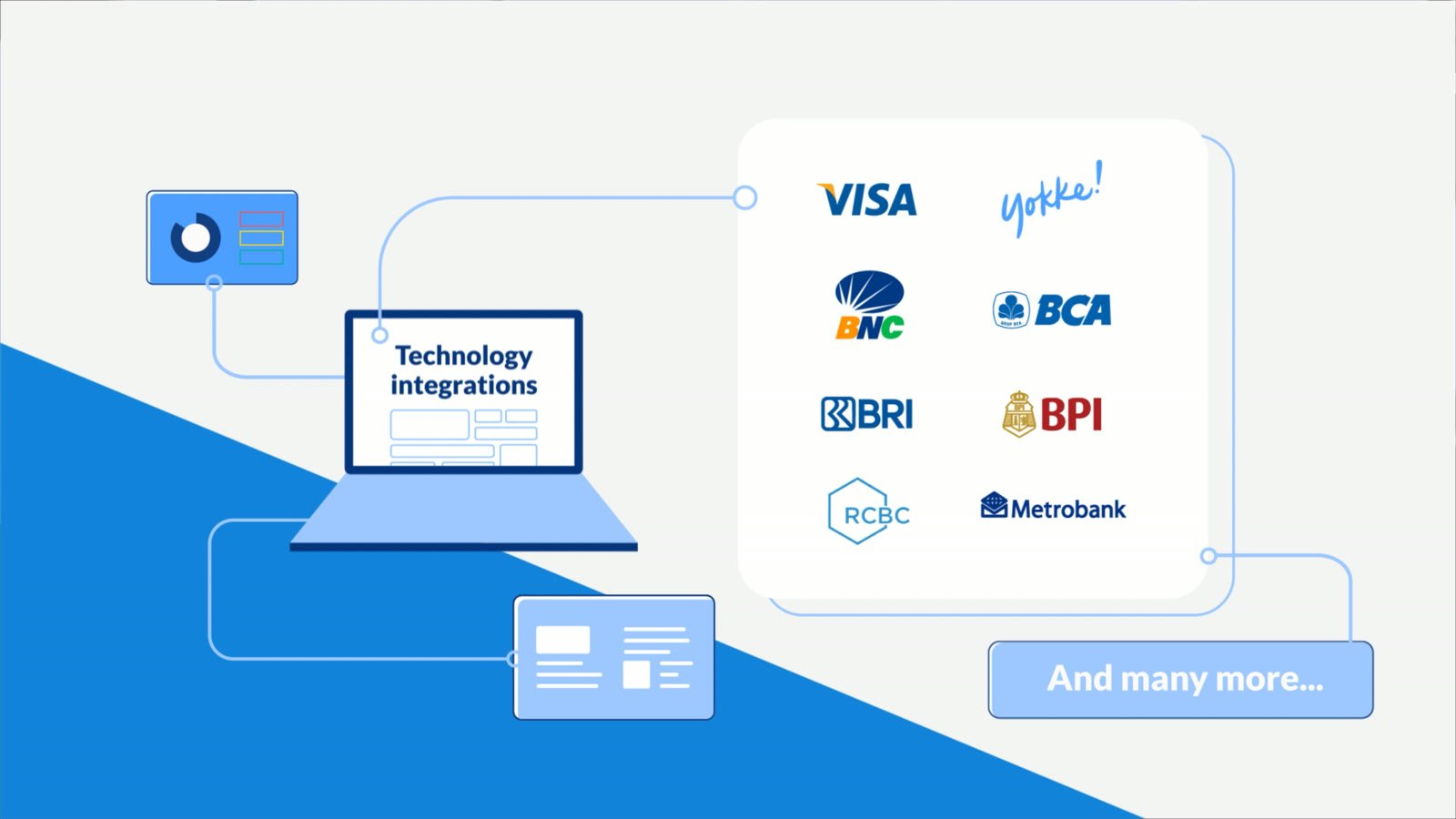
The company had never made an animated video, so the animation style had to start from zero, guided only by its brand guidelines: minimalism, icon-based visuals, no characters, clean elements.
02Approach
- Motion inside the guidelines
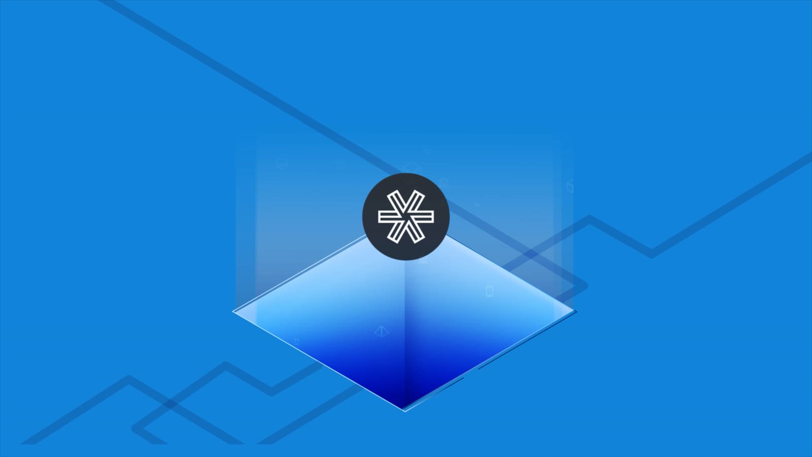
- I stayed within the guidelines and added motion to the existing elements, with fluid transitions that follow their movement.
- A style the company can reuse
- The result is an animation style Brankas can apply to future projects.
Frames and process



Tools
- After Effects
- Illustrator
- Photoshop
- Milanote
- PureRef
Next case